
A problem is identified in a healthcare setting, and a quality improvement change is implemented to solve it. Change is in progress. But then someone asks the big question: Are the changes actually resulting in improvement?
As healthcare professionals know, simply tracking data isn’t enough.
We have to interpret the data to know whether improvements were made, or if things have simply changed neither for the worse or for the better.
In the IHI’s healthcare model for improvement, the second question asked by this framework is, “How do we know that a change has resulted in an improvement?”
A run chart helps to answer this question.
What Is a Run Chart?
A run chart, also called a time-series chart or graph, is a tool commonly used in quality improvement.
A run chart is a simple yet powerful tool. The simplicity of a run chart makes it easy to construct, easy to interpret, and allows it to be used at the start of a project as soon as data is being collected.
Run charts display data over time as plots on a line graph. They’re used for the purposes of plotting data over time, analyzing that data, identifying whether patterns are present, and determining whether changes made to a process are actually resulting in improvements. Run charts help teams infer the actual effects of a change and see them in a linear viewpoint, versus just tracking data.
How Can Run Charts Be Used?
Common uses of run charts include:
- Tracking information
- Predicting patterns or trends
- Determining if a process variation is common cause or special cause
- Determining whether a process is stable or unstable
To improve any process, it’s important to understand whether its variation is common cause variation or special cause variation. Common cause means there’s a stable or predictable system, while special cause means there’s an unstable or unpredictable system. Run charts can be used for identifying whether common cause or special cause is occurring in the process.
How to Create and Interpret a Run Chart
To create a run chart, start by plotting your units of time on the X-axis in chronological order, typically in weekly or monthly increments, and beginning when data collection starts. For example, you might start with Week 1 (first week of data collection) and end with Week 10.
Next, plot your unit of measurement scale on the Y-axis. For example, you might be measuring % Unreconciled Medications between 25% and 55%.
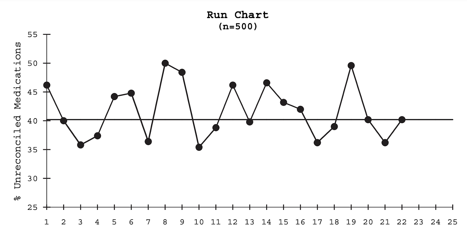
You should plot a minimum of 10 data points in your graph. When enough data has been plotted, you’ll plot the median, which is a horizontal line that divides your data in half.
At the end of data collection, analyze the chart by interpreting how values fall in the chart. Runs are consecutive points that occur on the same side of the median line, and there are two rules for interpreting runs: shifts and trends.
Shifts and Trends
Shifts are runs made up of six or more consecutive data points that occur either all above the median line or all below it. Points that fall on the median don’t count, nor do they break a shift. A shift should be investigated, as it identifies a nonrandom variation.
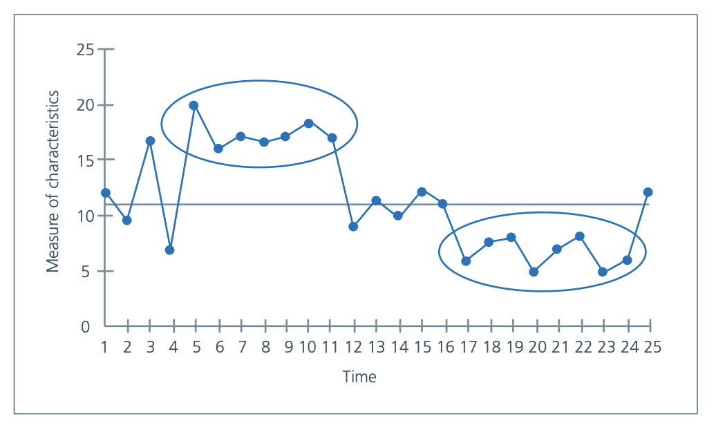
Trends are runs made up of five or more consecutive points that scale up or five or more consecutive points that scale down. Note that repeating values do not make or break a trend. A trend may indicate a nonrandom variation and should be investigated.

Run Chart Templates
While run charts are commonly used in quality improvement, they could be utilized even more often by health professionals who want to gain insight into process performance.
To make this possible, run chart templates are available in Excel or can be created in Microsoft Word as well. Try this run chart template from IHI to start plotting your data collection now.

Recent Comments