
Optimization in the healthcare space is an ongoing challenge, but as technologies advance and spaces change, optimization is a necessity. Optimization starts by analyzing current processes, and tools such as Pareto charts are available to help you accomplish this.
When analyzing a process with the goal of optimizing, there are two critical areas of the process that need to be identified: the frequency of any defects or problems, and the impact that the defects or problems have on the process. To measure frequency and categories of events, creating a Pareto chart is helpful.
For quality improvement initiatives, it’s best practice to identify which problems, when changed, will make the greatest positive impact. But, the precursor to identifying impact is to measure current data and analyze it in a systematic way.
In comes the Pareto chart. The Pareto chart is a quality tool; it’s a bar chart representing the types of defects/problems and the corresponding frequency/cost of the problem.
Let’s first look at an example, then review how to use it.
Pareto Chart Example
As you can see in the Pareto chart example below, the bar chart includes seven types of medication errors, each error represented by a bar whose height shows the number of occurrences per error. The errors are sorted from highest to lowest, then the numbers are illustrated out of 100 to create a percentage.
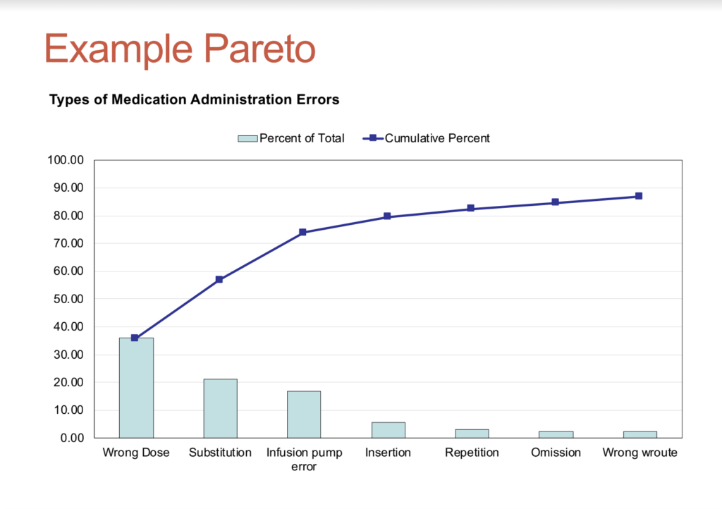
Source: Buck, D. (2017). A practical approach to quality improvement and performance management [PowerPoint slide].
In this example, wrong dose errors (36%) are the largest number of errors followed by substitution and infusion pump errors. Together, these three categories make up almost 80% of the errors.
An arc then maps the cumulative percentage of all errors. What is usually seen is that a small number of categories represent a large number of events. Such is the case in the medication pareto chart above. This gives a target for improvement work. For example, targeting wrong dose, substitution and infusion pump errors would have dramatic impact on reducing overall medication errors.
How to Use a Pareto Chart
When creating a Pareto chart, follow this order of tasks:
- Categorize your data by either defects, count, or cost.
- Rank your factors in the order of magnitude of their effect.
- Sort from the largest number to the smallest.
- Convert numbers to percentages.
- Track cumulative percentage with an arc above the bars.
Using a Pareto chart or diagram is useful because it ultimately allows teams to identify areas that have the greatest potential for impact, then focus their improvement projects on those areas.
Once your bar chart is filled and the cumulative percentage arc is mapped, you can start to interpret. If you have a steep line in your cumulative percentage, that indicates that these problems should be prioritized since they have a significant cumulative effect. Lines/arcs that are flatter have less influence, and therefore can be deprioritized.
The Pareto Principle
You’ve likely heard of the 80/20 rule.
In business, it’s said that 80 percent of sales come from 20 percent of your customers. In terms of Pareto charts, the rule implies that 80 percent of problems are due to 20 percent of sources. This is called the Pareto principle, also called the law of the vital few and the trivial many.
The Pareto chart illustrates the vital few (20 percent) of sources that when improved will offer the largest impact, as well as the trivial many (80 percent) that offer the lowest promise of gain for the effort.
Use Pareto charts to identify the 20 percent that provides the best opportunity to achieve maximum impact.
Related Articles:

Recent Comments